Centennial College Student Association
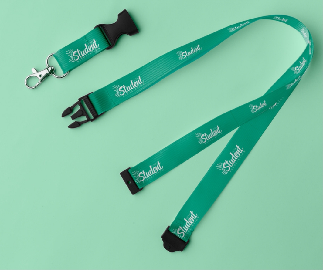
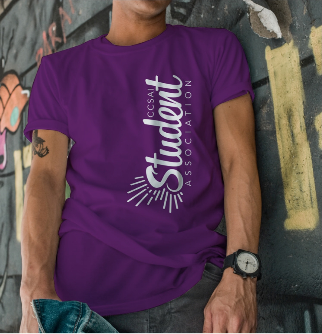
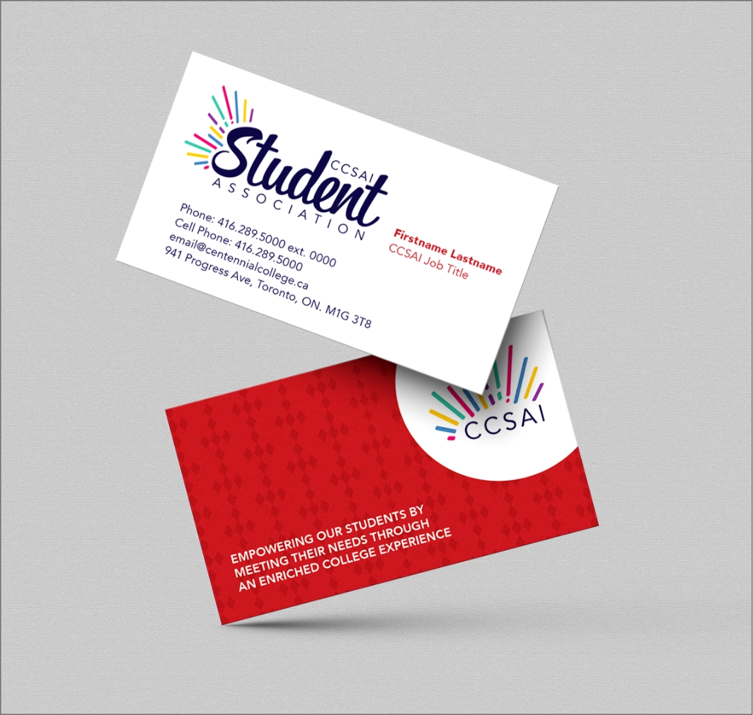
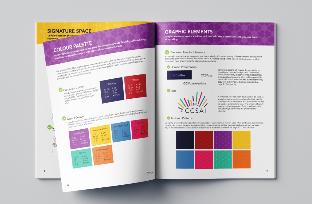
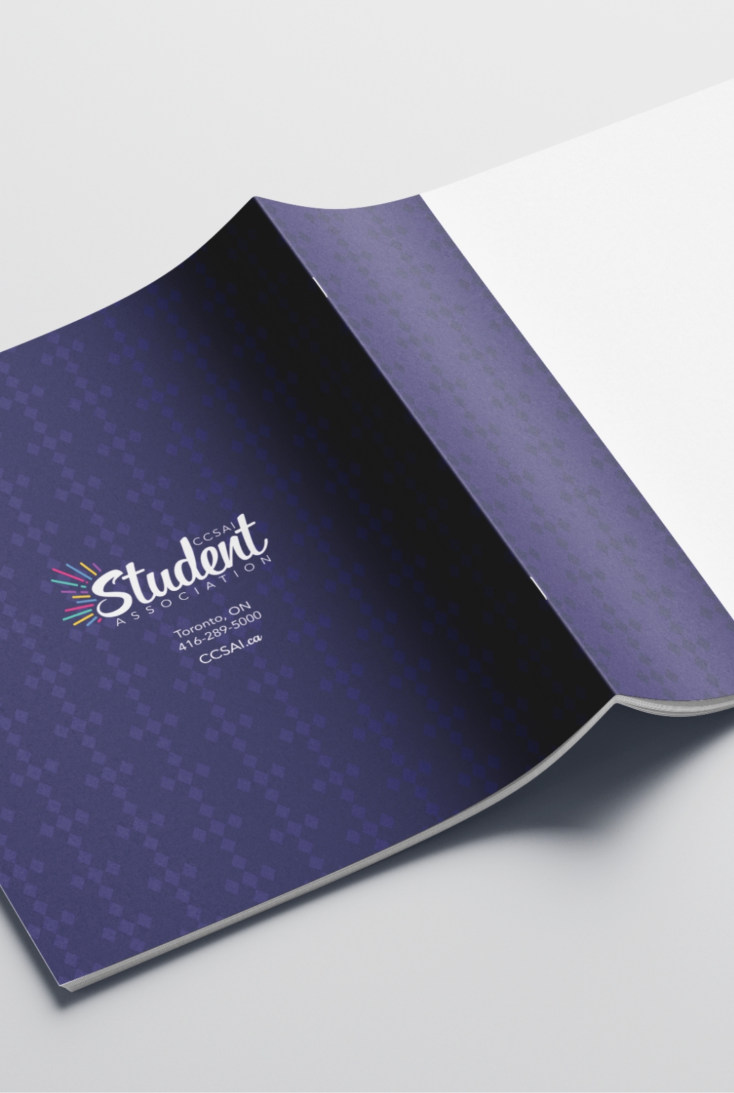
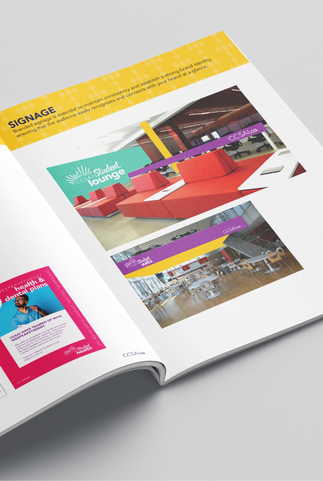
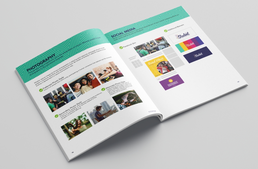
We supported the CCSAI brand refresh and strategy through a comprehensive range of services, including brand positioning, creative direction, and graphic design. This involved developing a new logomark, curating fonts, and creating an extensive suite of digital assets such as icon sets, sub-brands, textured backgrounds, and templates for stationery, posters, and social media graphics. Our approach ensured a consistent and engaging visual identity, aligning the brand with CCSAI’s core values of inclusivity and community through detailed brand audits and workshops.
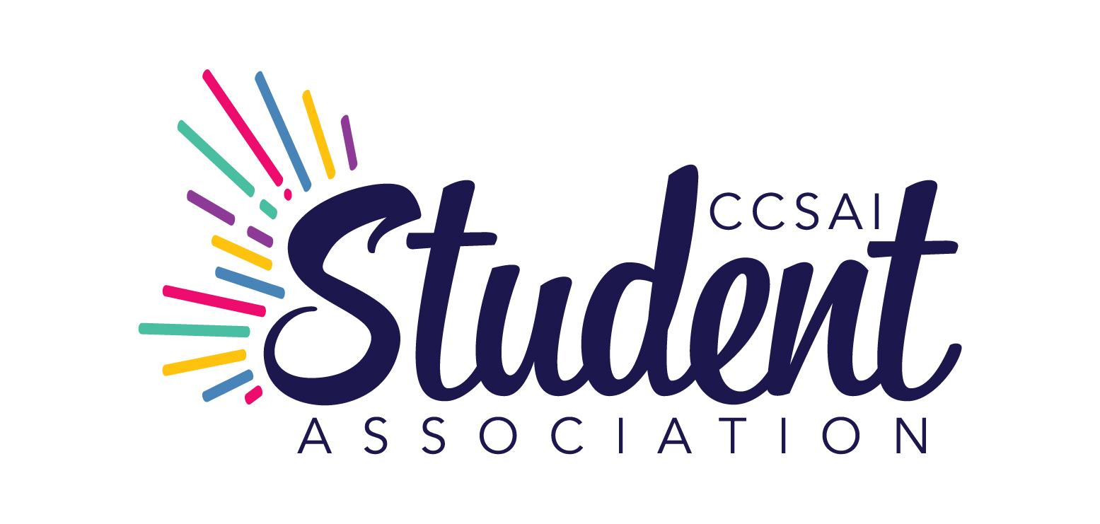
The graphic design for the CCSAI brand refresh was rich in symbolism and meaningful representation, reflecting the organization’s core values and mission. The new logomark featured vibrant colours and playful shapes, symbolizing diversity, energy, and the dynamic nature of student life. Each colour and design element was chosen to represent various aspects of the student experience, creating a visual narrative that was both inviting and inclusive. The iconography was designed for easy recognition and accessibility, using familiar shapes to evoke a sense of community and connection.
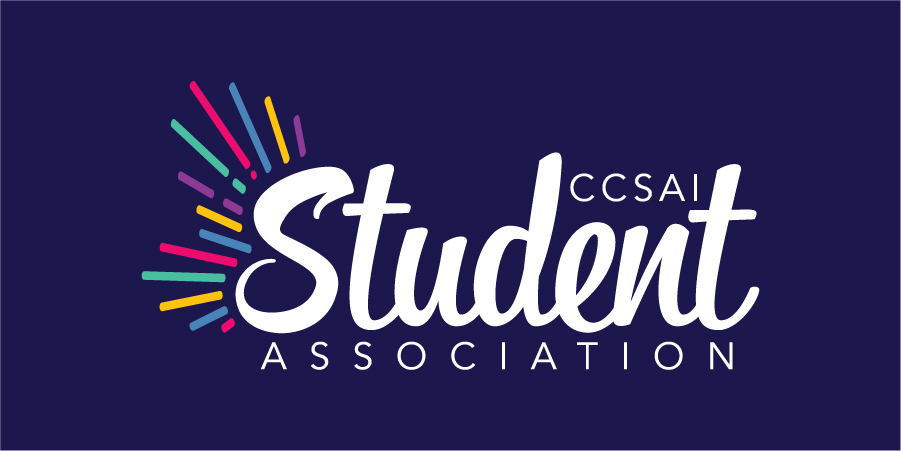






The refreshed CCSAI brand identity successfully created a cohesive and engaging presence that resonates with the student community. The development process included a careful selection of brand assets and symbolic elements that reflected CCSAI’s core values, with a tone that was approachable, passionate, and community-minded. Typography was selected for readability and familiarity, while a vibrant colour palette and playful graphic elements were designed to evoke energy and inclusivity. Consistent application of these elements across stationery, posters, social media, and swag & apparel ensured a unified brand experience. Additionally, thoughtful iconography and, where applicable, photography enhanced the visual appeal and accessibility of the brand, making it an empowering and reliable resource for students.


