SOGIE
The SOGIE (sexual orientation, gender identity, and gender expression) initiative, developed by Ontario Association of Children’s Aid Societies (OACAS), focuses on creating a centralized, culturally responsive platform for caregivers, professionals, and individuals navigating diverse SOGIE experiences within the child welfare system. Through a comprehensive suite of services, including brand positioning, creative direction, and meticulous graphic design, we brought the SOGIE brand to life. The project involved developing a new logomark, curating fonts, creating various textured patterns and designing communication templates. By incorporating vibrant colours and inclusive symbols, we ensured the visual identity aligned with the core values of inclusivity, diversity, and safety, fostering a sense of belonging and community. The new brand reflects SOGIE’s commitment to empowering individuals to express their authentic selves without fear or judgment, reinforcing their dedication to awareness-raising and advocacy.
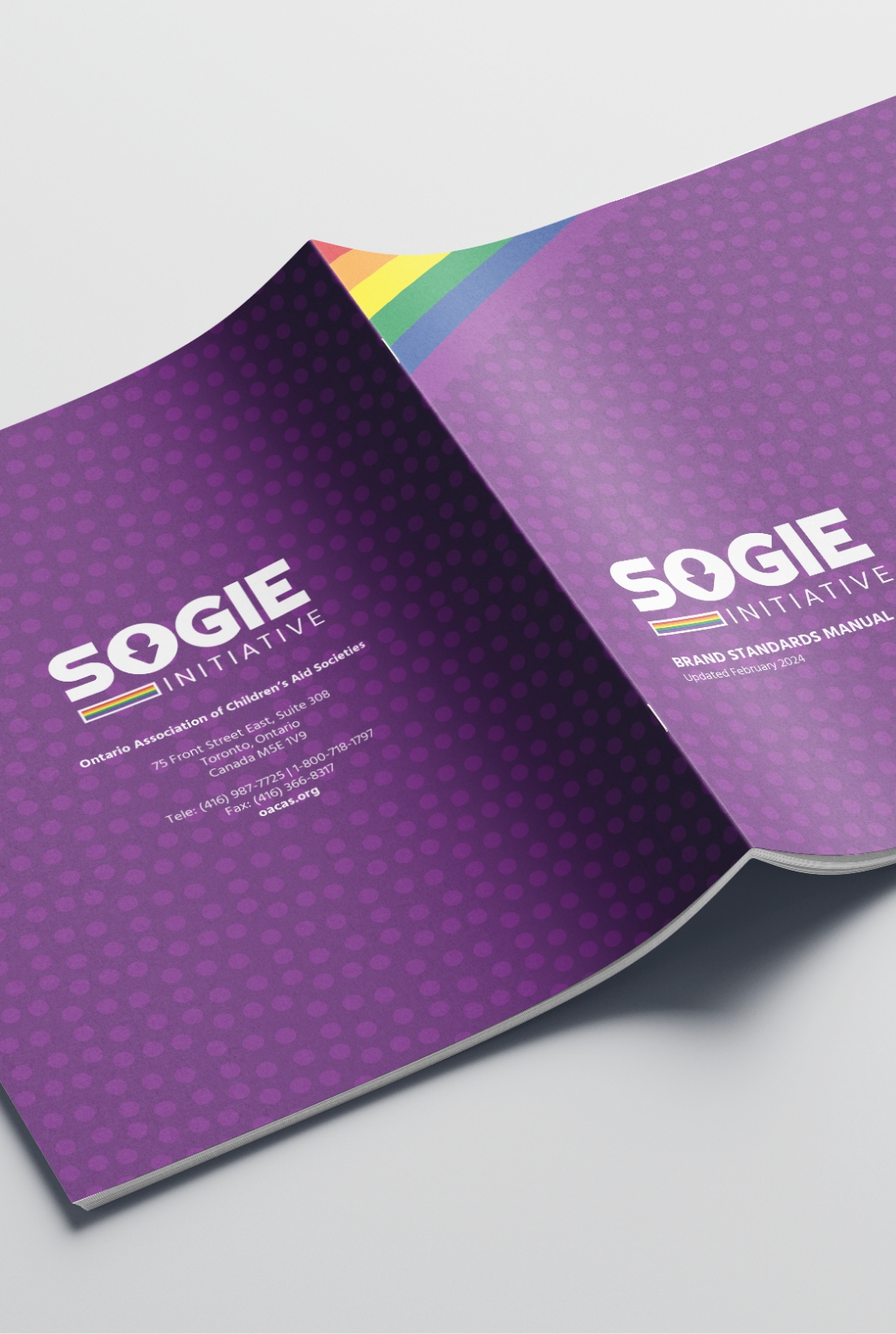
The brand indentity for the SOGIE initiative was developed with deep symbolism and meaningful representation to reflect the core values and mission of inclusivity and diversity. The new logomark seamlessly blended intricate symbols inspired by diverse global communities, each element carrying profound significance to convey interconnectedness and unity. The vibrant colours of the PRIDE flag were incorporated to celebrate LGBTQ+ identities, ensuring the brand resonated with its audience. The use of familiar shapes and inclusive imagery created a visual language that is both inviting and empowering. This thoughtful approach to design ensured that every element of the visual identity not only appealed aesthetically but also reinforced SOGIE’s commitment to providing a sanctuary where diverse identities can thrive, fostering a sense of safety, belonging, and community.
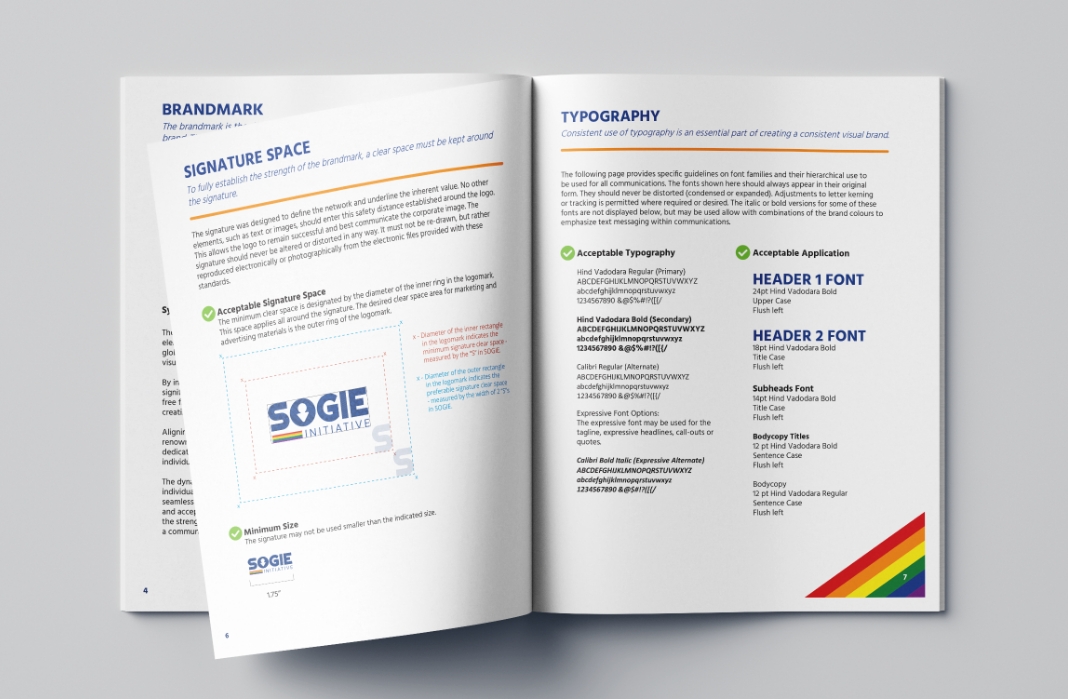
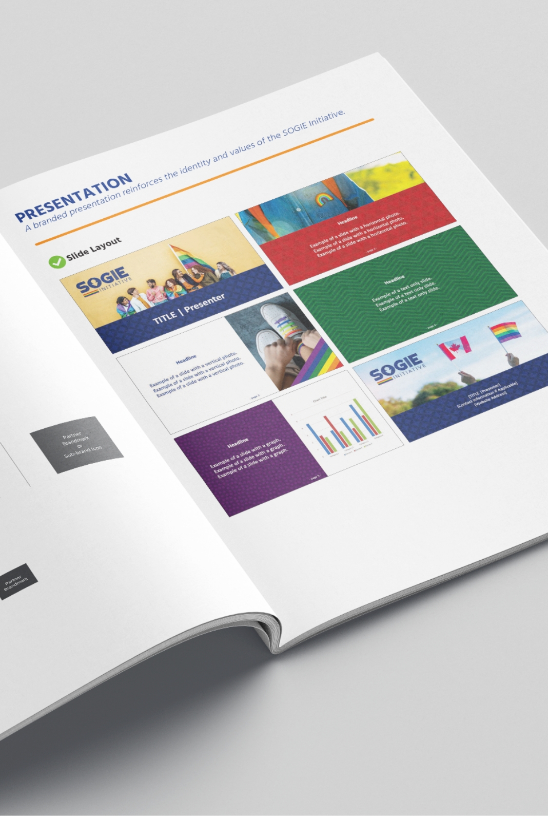
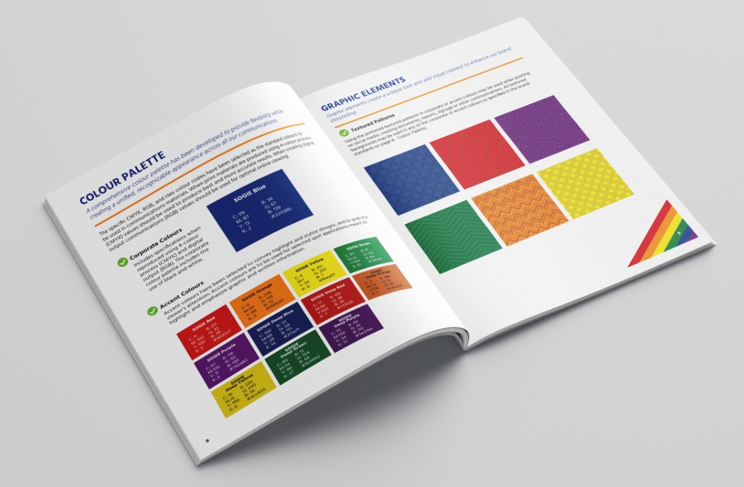
The refreshed brand identity for SOGIE has succeeded in creating a cohesive and engaging presence that resonates deeply with its diverse audience. Key aspects of the development process included the careful selection of brand assets and symbolic representation to reflect SOGIE’s core values of inclusivity, diversity, and empowerment. The tone of the brand was crafted to be welcoming, supportive, and vibrant, ensuring clear and concise messaging across all communications. Typography was chosen for its readability and familiarity, contributing to the approachable feel of the brand. The colour palette, inspired by the PRIDE flag, along with thoughtfully designed graphic elements, evokes energy and inclusivity, while consistent application across all media—from stationery and social media to presentation templates—ensures a unified brand experience. Photographic representation was utilized to further enhance visual appeal and accessibility, making the brand a reliable and empowering resource for all individuals within the SOGIE spectrum.


