Your Support Services Network
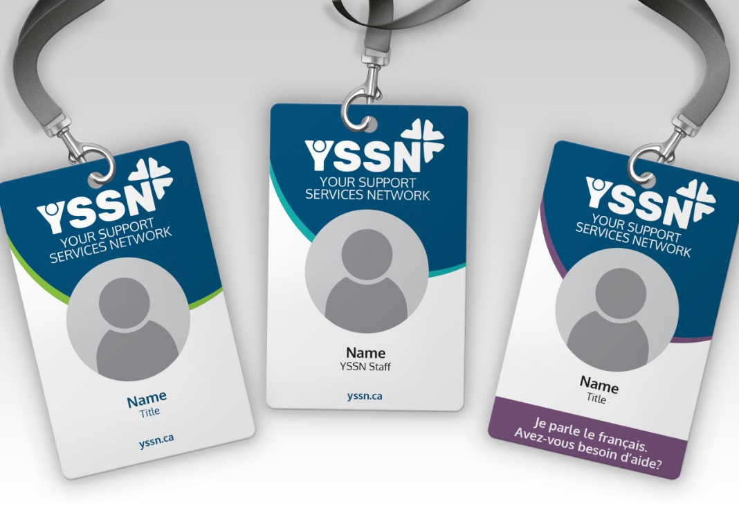
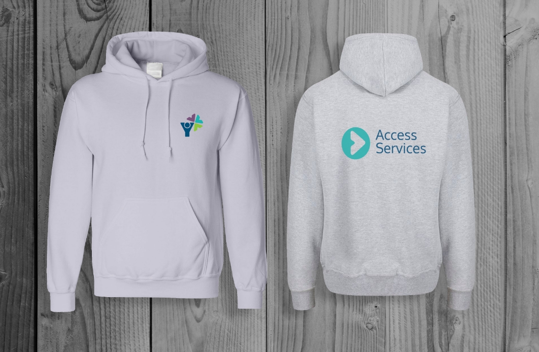
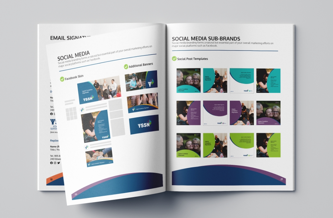
To achieve the YSSN rebranding, we implemented a comprehensive strategy that included brand positioning, creative direction, and the development of visual elements and communication tools. This effort involved developing the new name ‘Your Support Services Network’ (YSSN), creating a new logo, selecting brand colours, and designing templates for various materials such as ID badges and social media graphics, all aligned with YSSN’s vision, mission, and principles. The objective was to transform the brand by addressing the gap between audience perceptions and the organization’s true identity, fostering a soft, approachable presence that broke down emotional barriers and encouraged engagement. By simplifying communications, avoiding exclusive language, and humanizing interactions, the new brand celebrated individual journeys while creating a supportive community atmosphere focused on comfort, safety, and empowerment.
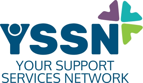
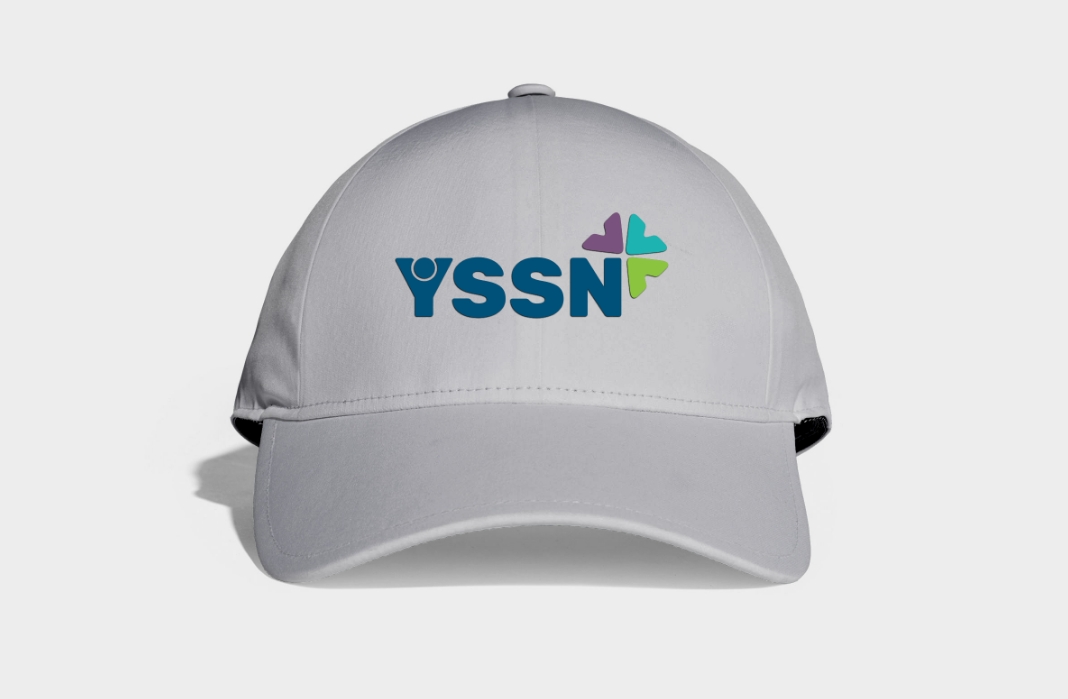
The new YSSN brand identity was designed to reflect the organization’s commitment to community, growth, and support. The logo emphasizes the individual, symbolizing inclusivity and the start of every journey. The colours—blue, green, teal, and purple—represent stability, growth, safety, calmness, and inspiration, respectively. Overall, the design aims to create a welcoming and nurturing environment that aligns with YSSN’s core values and mission, celebrating diverse individuals and fostering well-being within the community.


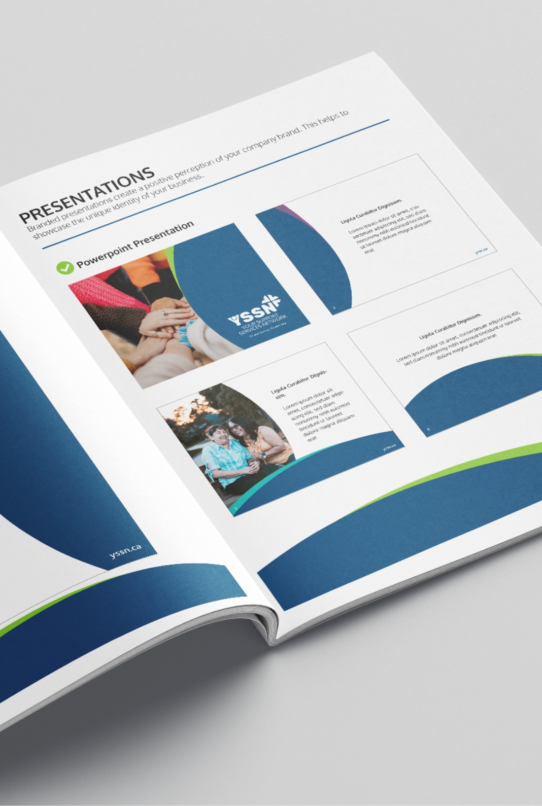
The rebranding initiative successfully revitalized YSSN’s brand identity, aligning it with its values and services. The new logo and brand colours symbolize community support and growth, creating a dynamic and engaging presence. YSSN now possesses a suite of communication tools, including ID badges, presentation templates, a press release kit, report templates, social media templates, and recommendations for an upgraded website skin. This comprehensive brand identity and powerful communication tools empower YSSN to make a lasting impact, foster growth, and promote well-being in the community they serve. The collaborative efforts and thoughtful design approach ensured the new brand resonated deeply with YSSN’s diverse audience, effectively communicating its mission and enhancing its overall presence and engagement.


