First Nation Technical Institute
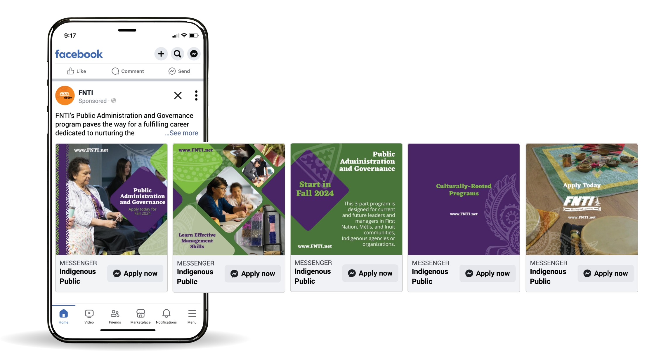
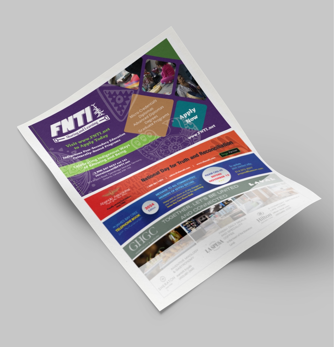
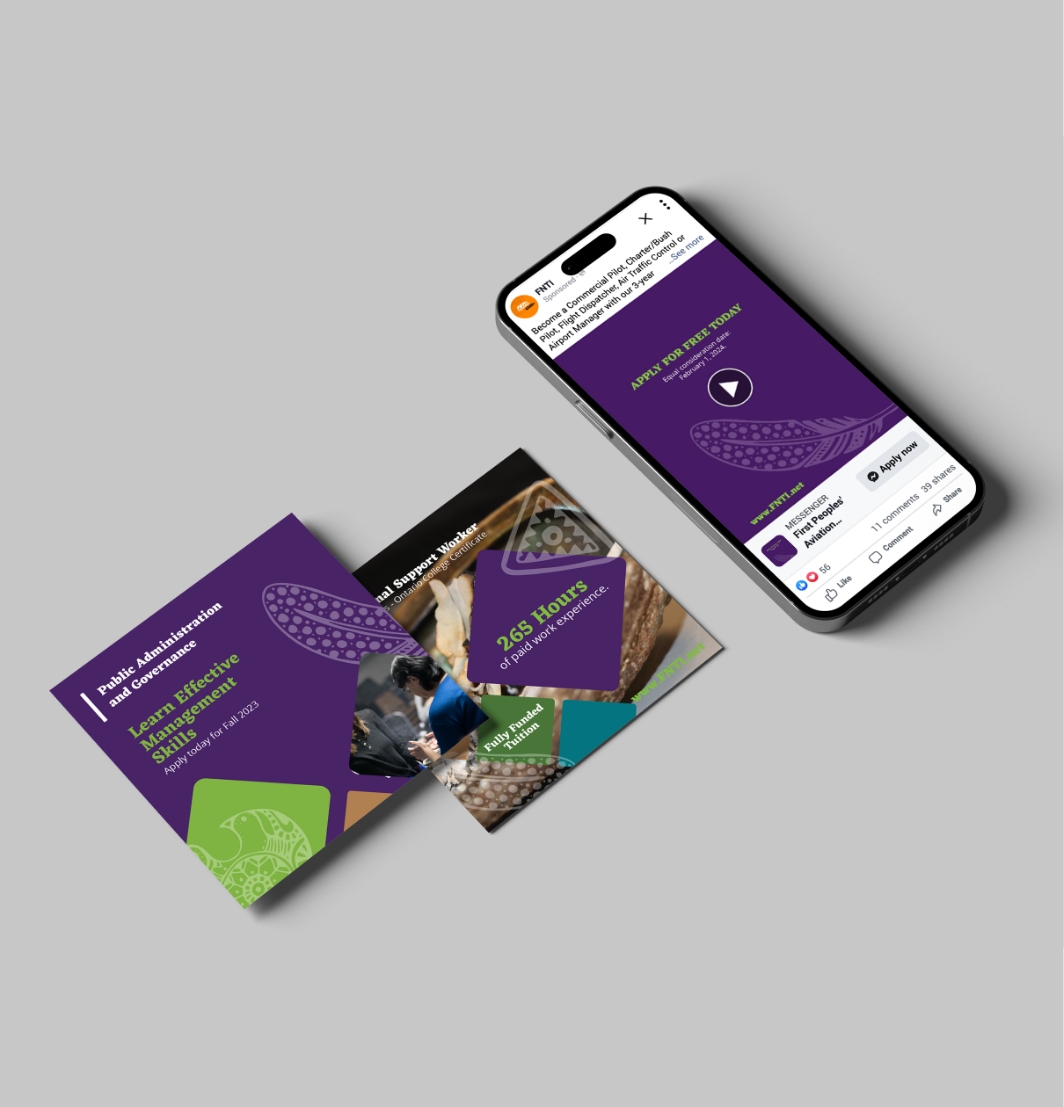
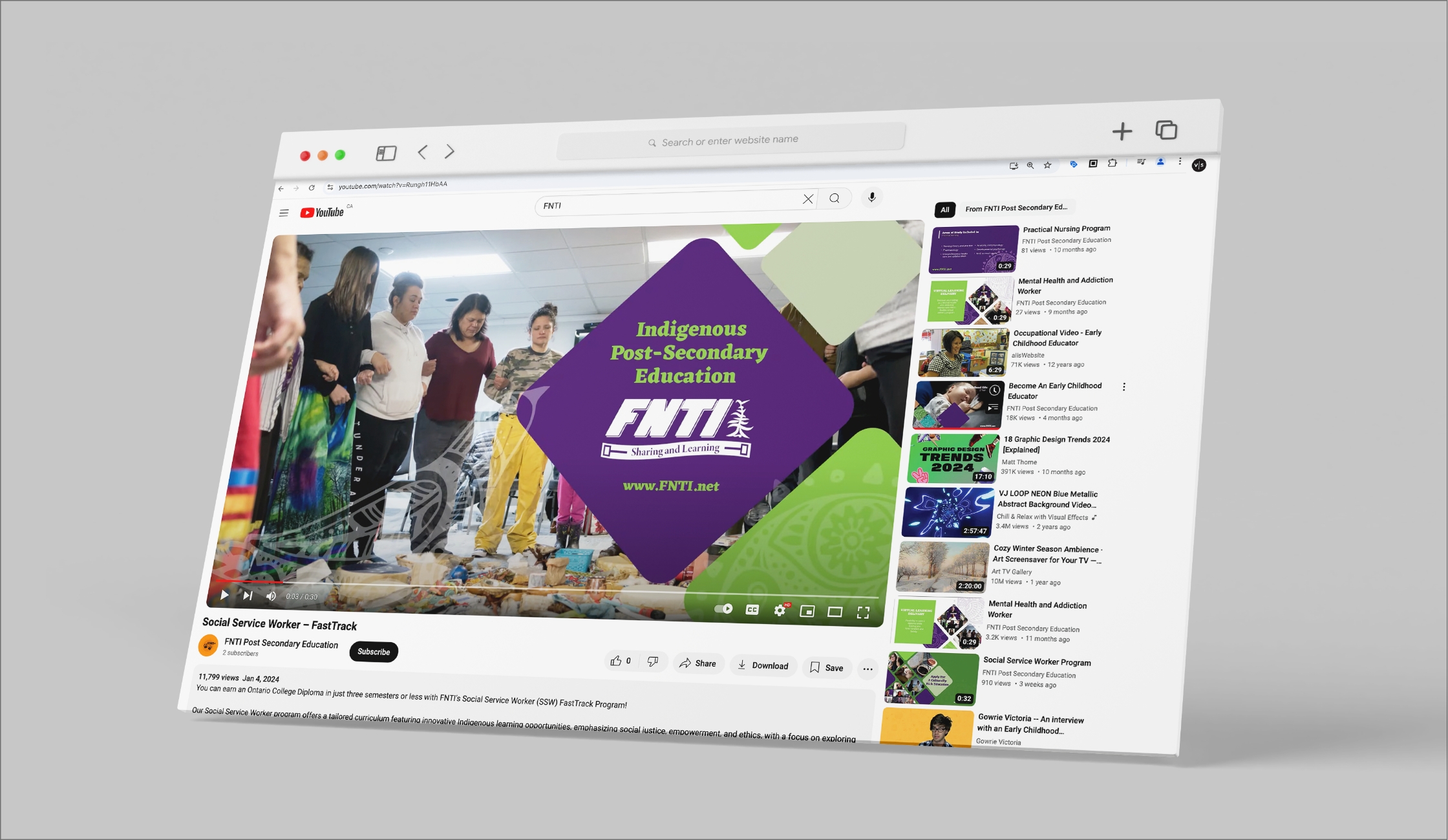
To achieve the FNTI recruitment goal, we crafted a marketing initiative to sensitively promote FNTI’s educational programs within Indigenous communities across Canada. The campaign prioritized fostering an inclusive and welcoming atmosphere through thoughtful marketing communications. Engaging content was developed, incorporating meaningful Indigenous imagery and music to authentically reflect the culturally rooted programs and Indigenous modes of learning. The strategy addressed recruitment challenges, such as adapting to virtual learning during the COVID-19 pandemic and reaching remote Indigenous communities. Using a low-barrier engagement approach on digital platforms, the campaign sought to spark interest and generate inquiries from potential students, while celebrating and respecting the rich diversity of Indigenous cultures.

As a result of the implemented marketing campaign, FNTI experienced significant success and positive outcomes. The campaign led to daily averages of 4,710 ad views and attracted 860 new individuals who engaged with the content. Additionally, the campaign generated 30 new inquiries from potential students. The success of the campaign was evident in the increased interest and engagement it generated, prompting the client to extend the campaign by an additional 6 weeks, beyond the initial 12–14-week period.


