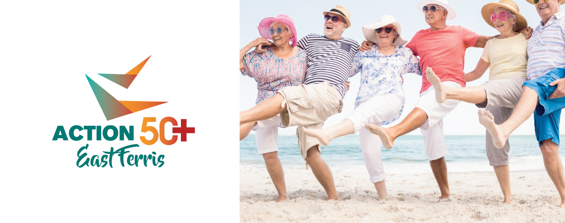
So long “Golden Age Club” we are fit, fun and full of life!
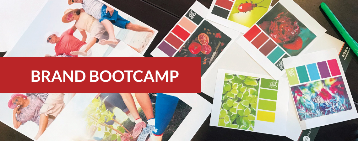
The Golden Age Club of East Ferris approached us with a fun rebranding project that allowed us to dust off the brand and make a statement. This vibrant group of 50+ members were ready to really showcase who they were. We were challenged by the need to create a name and logo that attracted a younger but technically senior demographic. The design needed to be bilingual and really represent the social club. A committee joined us for a fun and interactive branding workshop that gave us the insights we needed to design up a storm and present a new logo.
The geometric “Birds” represent freedom and the social connection that a “flock” or “birds of a feather” represent, which is to group together those with similar characters or interests. The common interest in this case would be the motivation to gain a social connection and healthy active lifestyle with those who are beyond the age of 50.
We had a lot of fun creating this design and we hope the members will feel just as vibrant as they celebrate their best years ahead!