
We happily took on the project of a vibrant and dynamic rebranding for the vibrant and healthy Municipality of East Ferris! This rural community approached us to help them with a full rebranding that included a new logo, typography, colour palette and voice that are applied to their stationery, printed and online communications, social media and apparel.
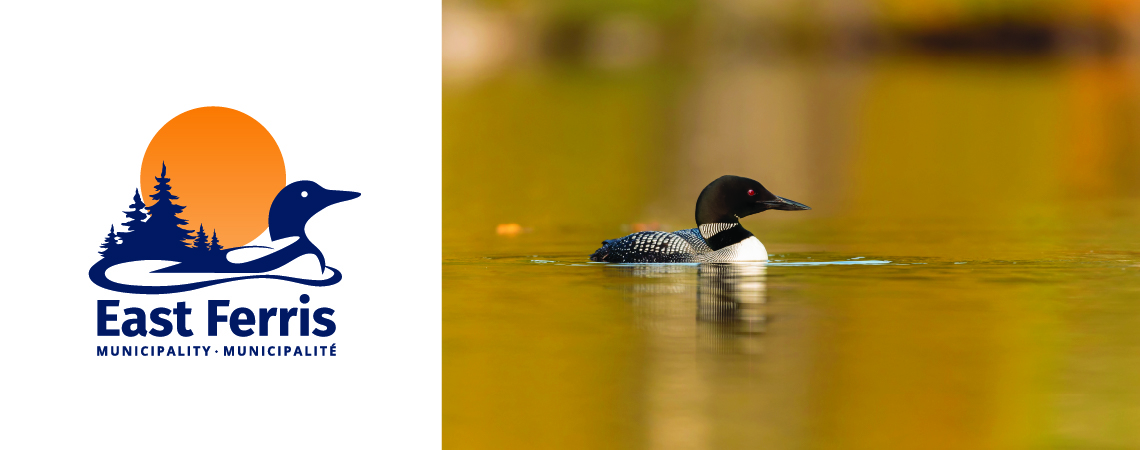
The loon symbolizes tranquility and nature, which is abundant throughout the region, and its presence is a strong indicator of lake health. It is believed by traditional cultures that the loon teaches us to follow our dreams. The loon has been placed in a forward motion to capture the idea of progressive leadership. The forest-scape silhouette represents nature, strength, peace, abundance, and also serves to embrace the rising sun. The sunrise symbolizes growth and opportunity. The use of a complete circle is a universal symbol that welcomes you in and invites positivity. The circle symbolizes a strong community. In this logo, we have combined the elements in a representation of the municipality. Nature, abundance and tranquility surrounds the positive, welcoming community; a community filled with a deep appreciation of their environment; a community led by progressive leadership.